Google Deck Templates
Challenge: Create a deck template for Google's product areas—like Cloud, Firebase, Android, etc.—to ensure a cohesive brand style that's easy to use for both the speaker and the editor.
I started out with Google Cloud’s deck speakers templates that would be used for conferences and educational videos and made my way to the other brands to ensure accessibility and brand loyalty.
Two speaker layout
2/3 slide + 1 speaker layout
Full screen speaker layout
Client
Google
Role
Creative Brand Strategist
Full screen code + 2 speaker layout
Full screen code + 1 speaker layout
Full screen code layout
Full screen screencast + 2 speaker layout
Full screen screencast + 1 speaker layout
Full screen screencast layout
Slide Deck Template for Google Cloud Speakers
Added a “Getting Started” Guide to show how to use template
These are the most commonly used slides, title slide, chapter slide, basic bullet point slide, agenda slide, statement slide, call outs slide, code slide, charts slide and tables.
The complete deck template had about 55+ slides
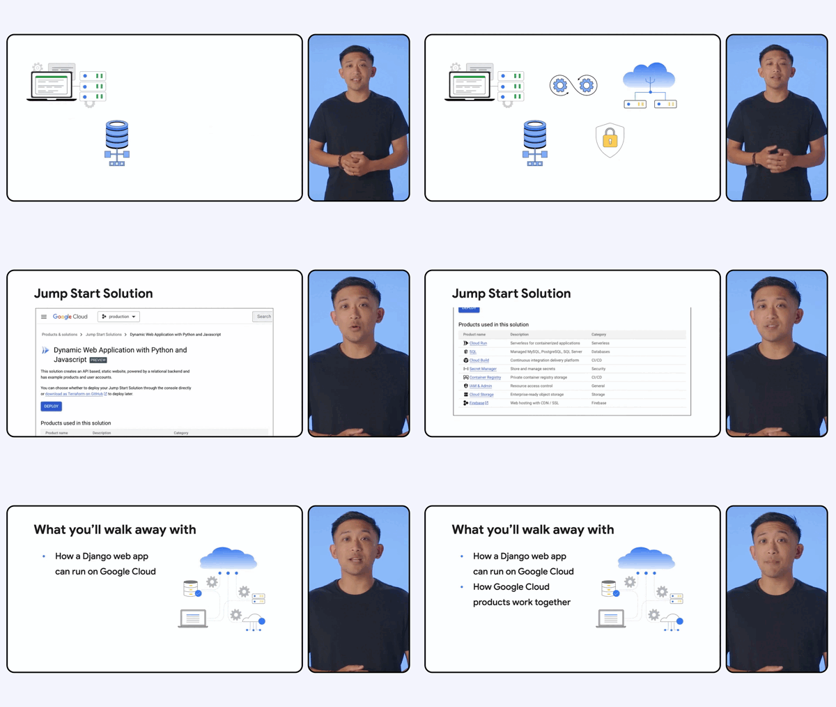
Slide deck speaker template in use: 2/3 slide deck with 1 speaker layout
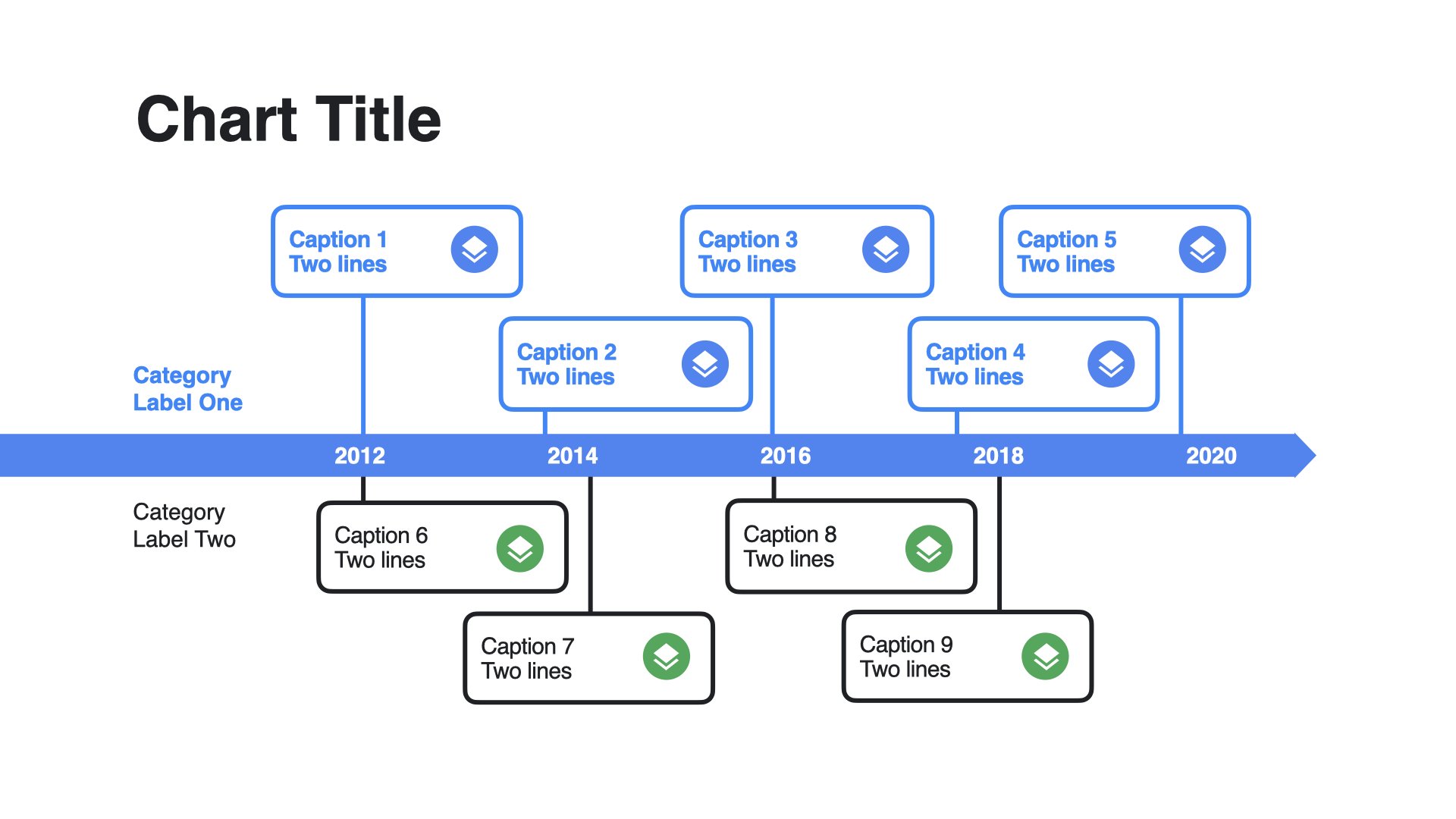
Slide deck template in use: Chart slide deck
Once Google Cloud adopted this template, I implemented this layout to other brands.
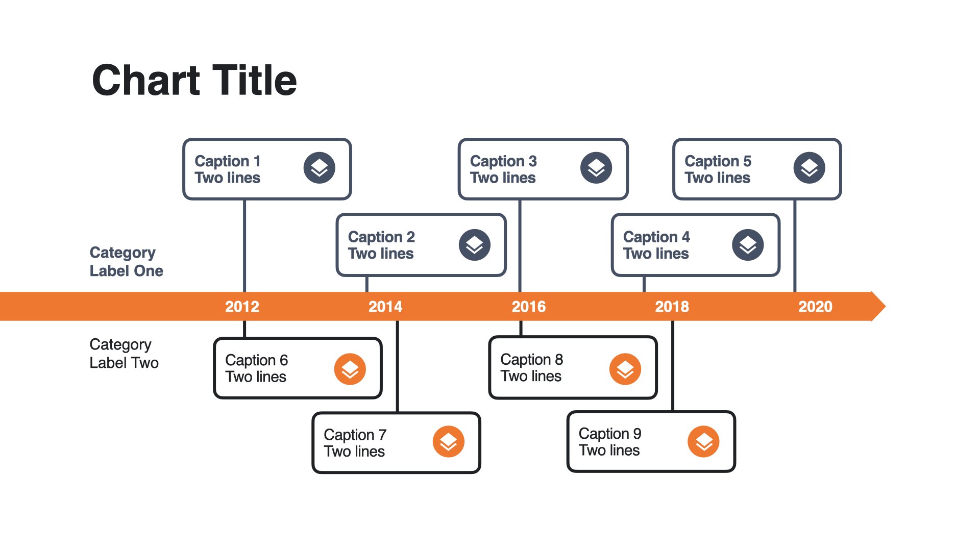
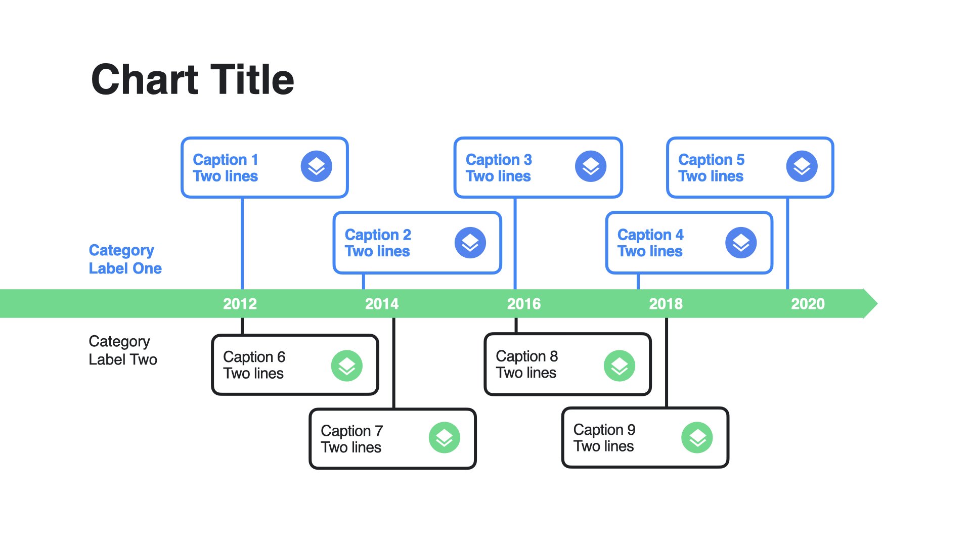
This is an example of how the chart slide got updated based on each brands color palette.
TensorFlow utilizes orange and dark blue tones
Android utilizes green and the same Google blue.
Lastly, thumbnails templates were created for videos posted on Youtube


